

こんにちは、Hugooの山本(2歳男の子のパパ)です。
前回のBEHIND THE CRAFTでは、私たちが目指す理想のマザーズバッグについてお話ししました。
使う人の生活に本当に寄り添うために、どんな視点でバッグをつくろうとしているのか。
その想いや設計の背景をお伝えしました。
今回はその続き。完成したサンプルを実際に使ってみて、どんな気づきがあったのか。
そしてそこから、どのような調整を加えて理想のかたちに近づけていったのか。
ものづくりの裏側を、さらに深くご紹介していきます。
実際に使って見えてきた「気になるところ」
ファーストサンプルが完成したあと、私たちは実地検証へと踏み出しました。
ただ眺めるだけではわからない、“使って初めてわかること”を確かめるために。
実際に自分の子どもと出かける日々の中で、このバッグを持ち歩き、使い続けました。
これは、Hugooのチームがとても大切にしている姿勢のひとつ。
私たち自身も子育て真っ最中だからこそ、机上の理想ではなく、「リアルな生活の中で気づくこと」をとても大切にしています。
“ちょっと気になる”を、ひとつずつ解消する
まず最初に気づいたのは、ポケットの仕様について。
試作品では2層だったポケットを1層にまとめた際、内側のフタ部分がぶらぶらと不安定になってしまうことがわかりました。
使えないわけではない。でも、ふとした瞬間に気になる、あの“ちょっとした不便”。
そういった違和感こそ、私たちが真っ先に向き合うべきポイントです。
このポケットには、内側にマグネットを仕込み、フタが自然に定位置に収まるように調整。目に見える部分は変わっていないようで、使ってみると確実に違う。
そんな“さりげない快適さ”を追求しました。
もうひとつ改善したのが、ショルダーストラップのパッド部分です。
子どもとのお出かけは、どうしても荷物が多くなります。
1時間、2時間と肩にかけ続けると、じわじわと負担が気になってくる。
そこで低反発のクッション素材を中に入れ、負担を軽減しつつ、見た目はすっきりと仕上げました。

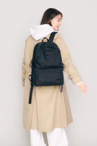
ロゴの在り方、ポケットの高さ——細部へのこだわり
正面に配置する予定だったHugooのロゴも、改めて見直しました。
当初は左の写真のようにロゴを白色でプリントしていましたが、せっかくのミニマルで美しいフォルムを邪魔しないように、ロゴは同型色のブラックで刺繍。遠くから見ると控えめに、でも近くで見ると分かる。そんな“ちょうどいい存在感”を目指しました。

さらに、フロントのドロストポケットも見た目と使いやすさのバランスを追求。
数cm単位で高さの違うパターンをいくつも試作し、実際の収納感や全体のデザインとの調和を検証しました。
ようやく見つけた、“Hugooらしい”答え
何度も、何度も、試作と修正を繰り返してようやくたどり着いた、私たちが思う「ベストなバランス」。Hugooが考える“新しいマザーズバッグのデザイン”を、ようやくかたちにすることができました。
この特徴的なデザインと仕様は、すでに特許庁にも出願済み。
マザーズバッグの新しい選択肢として、Hugooならではのスタイルがしっかりと詰まっています。
次回のBEHIND THE CRAFTでは、いよいよこの製品のこだわりの仕様を、ご紹介する予定です。
小さな違和感と向き合い続けた、その先に生まれた“理想のかたち”を、どうぞお楽しみに。
Hi, I’m Yamamoto from Hugoo—a dad to a lively two-year-old boy.
In the last edition of BEHIND THE CRAFT, we shared our vision for the ideal mother’s bag.
We talked about the mindset behind our design process and the values we hold when creating something that truly fits into the lives of those who use it.
This time, we're diving deeper.
We’ll share what we discovered after actually using our first sample, and how we made refinements based on those real-life insights.
We hope you enjoy this behind-the-scenes look at how we brought our vision closer to reality.
Real Use, Real Insights
Once the first sample was completed, we took the next step—real-life testing.
There are things you simply can’t see by looking; you have to use the product in your everyday life to truly understand it.
So we took the bag out into our daily routines with our own children, using it again and again in all kinds of situations.
At Hugoo, this hands-on testing is a crucial part of our process.
Because we’re parents ourselves, we deeply value the lessons that come from real experiences—not just ideas on paper.
Solving the “Small but Not-So-Small” Issues
One of the first things we noticed was an issue with the pocket design.
Originally a two-layer pocket, we decided to simplify it into one layer—but this left the inner flap dangling awkwardly.
It wasn’t unusable, but there was a small imbalance that just didn’t feel right.
And those little discomforts? They're exactly what we aim to fix.
To address it, we added a hidden magnet inside the pocket. This small tweak helped the flap stay neatly in place, making it feel more intuitive and stable.
You might not see the change at first glance, but once you use it, the difference is clear.
It’s that quiet kind of comfort we’re always aiming for.
A Shoulder Pad Designed for Real Parenting
Next up was the shoulder strap.
When you're out with a child, you're often carrying a lot more than you expect.
Even if a strap feels fine at first, after an hour or two on your shoulder, you start to feel the strain.
To make it more comfortable, we added a low-rebound cushion inside the shoulder pad.
It absorbs pressure effectively, while still keeping the overall look clean and minimal.
This balance between comfort and appearance is something we really care about.
Rethinking the Logo & Pocket Placement
We also took a fresh look at our logo placement.
We had initially planned to place it front and center, but it felt too bold for the bag’s minimalist design.
So instead, we embroidered the Hugoo logo in a tone-on-tone black—subtle from a distance, but clearly there when you look closer.
It’s just the right amount of presence.
As for the front drawstring pockets, we went through multiple prototypes, adjusting the height by centimeters at a time.
We tested how each version looked, how easy it was to use, and how well it blended with the overall silhouette.
Finally, the “Just Right” Hugoo Balance
After countless rounds of trial and error, we finally landed on what felt like the perfect balance.
This, we believe, is Hugoo’s answer to a new kind of mother’s bag.
We’ve already filed for design registration with the Japan Patent Office to protect the unique elements of this product.
Every part of it reflects the Hugoo way—practical, thoughtful, and designed with real life in mind.
In the next BEHIND THE CRAFT, we’ll be revealing the final product and walking you through all its standout features.
We can’t wait to show you how the little things we cared so much about came together to form something we’re truly proud of.